Custom card feature
Some dashboard cards have support for features. These widgets add quick controls to the card. We offer a lot of built-in features, but you're not just limited to the ones that we decided to include in Home Assistant. You can build and use your own in the same way as defining custom cards.
Defining your card feature
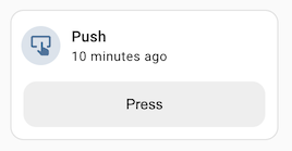
Below is an example of a custom card feature for button entity.
import {
LitElement,
html,
css,
const supportsButtonPressCardFeature = (hass, context) => {
const stateObj = context.entity_id
? hass.states[context.entity_id]
: undefined;
if (!stateObj) return false;
const domain = stateObj.entity_id.split(".")[0];
return domain === "button";
};
class ButtonPressCardFeature extends LitElement {
static get properties() {
return {
hass: undefined,
config: undefined,
context: undefined,
};
}
static getStubConfig() {
return {
type: "custom:button-press-card-feature",
label: "Press",
};
}
setConfig(config) {
if (!config) {
throw new Error("Invalid configuration");
}
this.config = config;
}
get _stateObj() {
if (!this.hass || !this.context?.entity_id) return undefined;
return this.hass.states[this.context.entity_id];
}
_press(ev) {
ev.stopPropagation();
const stateObj = this._stateObj;
if (!stateObj) return;
this.hass.callService("button", "press", {
entity_id: stateObj.entity_id,
});
}
render() {
if (
!this.config ||
!this.hass ||
!this.context ||
!supportsButtonPressCardFeature(this.hass, this.context)
) {
return null;
}
return html`
<button class="button" @click=${this._press}>
${this.config.label || "Press"}
</button>
`;
}
static get styles() {
return css`
.button {
display: block;
height: var(--feature-height, 42px);
width: 100%;
border-radius: var(--feature-border-radius, 12px);
border: none;
background-color: #eeeeee;
cursor: pointer;
transition: background-color 180ms ease-in-out;
}
.button:hover {
background-color: #dddddd;
}
.button:focus {
background-color: #cdcdcd;
}
`;
}
}
customElements.define("button-press-card-feature", ButtonPressCardFeature);
window.customCardFeatures = window.customCardFeatures || [];
window.customCardFeatures.push({
type: "button-press-card-feature",
name: "Button press",
isSupported: supportsButtonPressCardFeature, // Optional
configurable: true, // Optional - defaults to false
});
Context
A card feature is rendered inside a card and receives the same context the card is bound to. This is passed both to the element as the context property and as the second argument of the isSupported function.
The context object exposes:
entity_id(optional): the entity id from the parent card.area_id(optional): the area id from the parent card.
If you want your feature to better integrate with the default design of home assistant, you can use these CSS variables:
--feature-height: Recommended height (42px).--feature-border-radius: Recommended border radius (12px). It be can useful to set button or slider border radius.--feature-button-spacing: Recommended space between buttons (12px). It can be useful if you have multiple buttons in your feature.
The main difference with custom cards is the graphical configuration option.
To have it displayed in the card editor, you must add an object describing it to the array window.customCardFeatures.
Required properties of the object are type and name. It is recommended to define the isSupported option with a function (hass, context) => boolean, so the editor can only propose the feature if it is compatible with the selected entity in the card. Set configurable to true if your entity has additional configuration (for example, label option in the example above).
Also, the static functions getConfigElement and getStubConfig work the same as with normal custom cards.